When it came time to rebuild my portfolio website, I had a single, slightly obsessive goal: A perfect 100/100 in Performance, Accessibility, Best Practices, and SEO on Google Lighthouse.
You can verify the result in this PageSpeed Insights desktop report.

In an era where many personal sites ship a framework runtime, hydration logic, analytics scripts, multiple font files, and oversized images before showing a single line of useful content, getting a perfect score required me to work backwards from the audit itself.
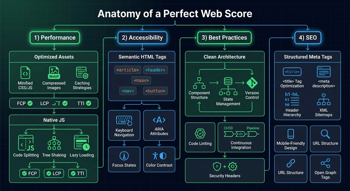
I treated Lighthouse as a systems-design problem. Every point lost usually comes from one of four things:
- Too much JavaScript.
- Too many bytes on the critical path.
- Unstable layouts and inaccessible interactions.
- Weak metadata and crawlability.
This portfolio now solves those issues deliberately, not accidentally. Here is the complete breakdown of the improvements I implemented across the site.
What I Actually Built
This is not just a single landing page. It is a static-first portfolio platform with a surprisingly capable architecture:
- Individual static pages for home, about, projects, blogs, and contact.
- A lightweight enhanced-navigation layer for internal page transitions.
- A markdown-driven blog system powered by a Node generation script.
- Auto-generated
posts/index.json, blog share pages, andsitemap.xml. - Searchable and filterable blog listings with in-session caching.
- A theme system that respects system preference and user choice.
- A scheduler modal that only loads its embed when the user actually asks for it.
That last point matters a lot: the site feels dynamic, but it does not pay the usual framework tax.
The Core Philosophy: Static First, JavaScript Last
The biggest decision was also the most important one: I did not use React, Next.js, Vue, or any SPA framework for the public site.
For a content-heavy portfolio, the browser already knows how to do the hard parts extremely well:
- parse HTML,
- apply CSS,
- lazy-load images,
- handle links,
- manage focus,
- and render semantic content instantly.
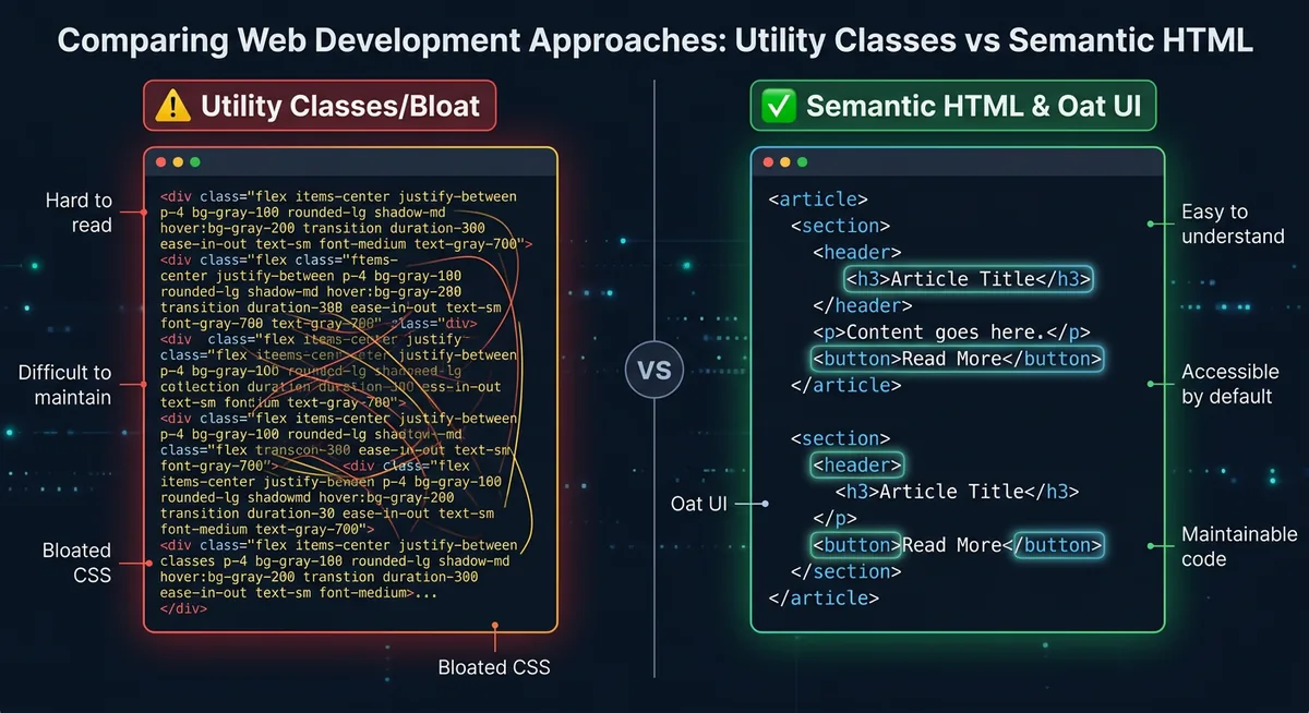
So instead of shipping a virtual DOM to paint static content, I used:
- Semantic HTML5 for structure,
- Oat UI for a tiny semantic baseline,
- Vanilla CSS for layout and visual polish,
- Vanilla JavaScript only for genuinely interactive enhancements,
- Node.js at build time to keep content, share pages, and sitemap data in sync.
That one architectural choice removed a huge amount of JavaScript execution, parsing, hydration, and long-task overhead before I even started micro-optimizing.
Performance Improvements That Moved the Needle
1. I Kept the Runtime Extremely Small
The site uses a very small amount of client-side JavaScript in site.js, and it is loaded with defer so HTML parsing is never blocked.
I also avoided the usual payload bloat:
- no framework runtime,
- no hydration payload,
- no client-side router bundle,
- no tracking-heavy third-party script stack,
- no custom webfont downloads on the critical path.
On the homepage, I also kept critical above-the-fold layout CSS directly in the document head so the first render does not have to wait on a large styling pipeline.
That dramatically improves initial paint, main-thread availability, and total blocking time.
2. I Used a Static-First Multipage Architecture
The main pages are already present as real HTML documents:
index.htmlabout.htmlprojects.htmlblogs.htmlcontact.html
That means the browser receives usable content immediately. Internal navigation is progressively enhanced later with fetch, DOM replacement, and the View Transitions API when available. If JavaScript fails or a feature is unsupported, the site still works as normal because standard links remain the foundation.
This is one of the cleanest ways to get both excellent UX and excellent Lighthouse numbers.
It also keeps state management refreshingly simple: for things like navigation state and theme state, the DOM is effectively the source of truth through native attributes such as data-theme, aria-expanded, and aria-current rather than a client-side state container.
3. I Optimized Images Aggressively
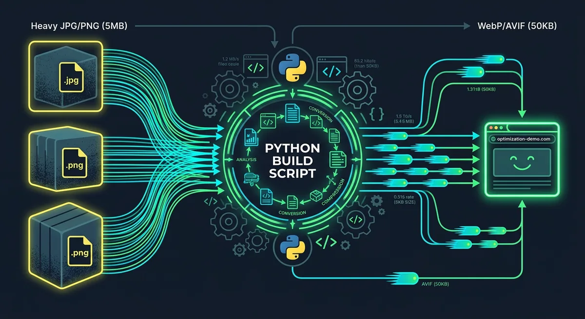
Images are one of the easiest ways to destroy performance, so I treated them like production assets instead of decoration.
The improvements include:
- Serving optimized assets from
image/optimized/. - Using responsive
srcsetandsizesfor major visuals. - Marking only the true hero image as
fetchpriority="high"andloading="eager". - Marking non-critical images as
loading="lazy". - Using
decoding="async"to reduce decode blocking. - Adding explicit
widthandheightvalues where appropriate. - Backing those dimensions up with CSS
aspect-ratiorules.
This combination improves the LCP path while also protecting against Cumulative Layout Shift (CLS).
4. I Eliminated Avoidable Layout Shift
Perfect performance is not just about speed. It is also about stability.
To keep CLS at effectively zero, I reserved space ahead of time:
- Hero and project media use stable
aspect-ratiovalues. - Dynamic blog sections reserve space with
min-heightplaceholders. - Images include intrinsic dimensions.
scrollbar-gutter: stableprevents content jumps when scrollbars appear.
A surprising amount of Lighthouse pain comes from tiny layout jumps that feel harmless during development but are obvious to the audit.
5. I Lazy-Loaded Expensive Embeds Instead of Front-Loading Them
The scheduling experience uses a modal with an embedded calendar, but the iframe is not loaded on first paint.
Instead, the iframe source is only assigned when the user opens the scheduler.
That means:
- no third-party embed cost during initial render,
- no unnecessary network requests for users who never open it,
- and no wasted execution time impacting the homepage score.
This one decision alone protects the critical path from a very common portfolio-site mistake.
6. I Cached Read-Mostly Content in Session Storage
The blog index and prefetched posts are cached in-session.
That means repeat visits to the blogs page avoid redundant fetches for posts/index.json, and prefetched markdown posts can render faster after navigation. It is a small optimization, but it improves responsiveness without adding architectural complexity.
7. I Used Progressive Enhancement for Navigation Instead of a Heavy Router
The enhanced internal navigation layer does three things well:
- fetches internal HTML pages,
- swaps only the main content region,
- uses
document.startViewTransition()when the browser supports it.
This produces a smooth app-like feel without the cost of turning the site into a full SPA.
If the feature is unavailable, the browser falls back naturally to normal page navigation. That resilience helps both user experience and best-practice quality.
Accessibility Improvements That Helped Me Reach 100
Accessibility was not a post-processing step. It shaped the markup from the beginning.
1. I Used Real Semantic Landmarks Everywhere
The site is built with native structure instead of anonymous div soup:
headernavmainsectionarticleasidefooterdialog
This dramatically improves screen-reader navigation and also tends to make the DOM easier to maintain.
2. Every Interactive Control Exposes Intent Clearly
Buttons and links include the attributes Lighthouse expects because they are also the attributes real users need:
aria-labelon icon-only and utility controls,aria-expandedon the mobile navigation toggle,aria-controlsto tie toggles to controlled regions,aria-current="page"for the active nav item,aria-pressedon the theme toggle,aria-live="polite"for dynamic blog content.
This makes the interface much more understandable for assistive technologies.
3. Keyboard Navigation Was Treated as a First-Class Requirement
Visible focus states are implemented with :focus-visible, not ignored or removed.
That means keyboard users can reliably track where they are across:
- navigation,
- theme toggles,
- social links,
- carousel controls,
- and interactive form-like controls.
Many sites lose accessibility points simply because they style hover states beautifully and forget focus altogether.
4. Decorative and Informational Images Are Distinguished Properly
I used empty alt text for decorative branding where the image should be ignored, and descriptive alt text where the image communicates actual information.
That prevents redundant screen-reader noise while still preserving meaning where it matters.
5. Theme Switching Works Accessibly
The theme system is not just cosmetic. It:
- respects
prefers-color-scheme, - persists the user’s explicit choice,
- updates the UI labels and pressed state correctly,
- and keeps the embedded scheduler aligned with the active theme.
The CSS also declares color-scheme, which helps browsers render built-in UI controls correctly in light and dark modes.
Best-Practice Improvements Beyond Raw Speed
Lighthouse Best Practices is where small engineering decisions start to matter.
1. I Kept Third-Party Usage Minimal and Intentional
Every third-party request has a cost. So I constrained them aggressively.
The site only uses a very small set of external dependencies where they add clear value, and expensive content like the scheduler is deferred until user intent is explicit.
That reduces attack surface, runtime noise, and unnecessary CPU/network work.
2. External Links Are Opened Safely
External destinations that open in a new tab use safe rel attributes such as noreferrer, which prevents a class of opener-related issues and aligns with modern best-practice expectations.
3. The Site Is Resilient When Features Fail
This is a subtle but important quality improvement.
Examples:
- If enhanced navigation fails, normal navigation still works.
- If storage access fails, the theme system and caching logic degrade gracefully.
- If the modal API is unavailable, the scheduler falls back to opening in a new tab.
- If View Transitions are unsupported, content swaps still happen without breaking navigation.
In other words, I designed for capability detection instead of assuming a perfect browser environment.
4. Build-Time Automation Prevents Content Drift
The script at scripts/generate-blog-share-pages.mjs generates and synchronizes:
posts/index.jsonposts/<slug>.htmlsitemap.xml
This ensures metadata and indexable URLs stay in sync with the source markdown instead of depending on manual updates. Build-time correctness improves both maintainability and SEO hygiene.
SEO Improvements That Closed the Last Gap
Performance alone is not enough. To get perfect SEO scoring, the site also needs to be machine-readable and crawl-friendly.
1. Every Page Has Strong Head Metadata
The HTML documents include:
- unique
<title>values, - descriptive meta descriptions,
- canonical URLs,
- Open Graph tags,
- Twitter card metadata,
- favicon metadata,
- and feed discovery links where appropriate.
That helps both search engines and link previews understand the site correctly.
2. Structured Data Is Present
The site includes JSON-LD schema, including Person on the homepage and BlogPosting on blog content pages.
Structured data is one of those details that users never see directly, but search engines absolutely do.
3. Crawlability Is Explicit, Not Left to Chance
I maintain:
robots.txtsitemap.xmlfeed.xml
That gives crawlers a clean path through the site and improves discoverability for both pages and blog content.
4. Shareable Blog URLs Are Generated Properly
Each markdown post gets a generated HTML share page under posts/<slug>.html that redirects to the rendered blog experience while preserving metadata. This improves indexing, sharing, and social preview behavior without introducing a heavier framework layer.
The Small Details That Also Matter
Perfect scores usually come from the accumulation of many small wins, not one giant trick. Some of the less glamorous but still important improvements were:
- using
dns-prefetchandpreconnectwhere external assets are genuinely required, - keeping CSS lean and modular,
- using responsive grids instead of heavy layout libraries,
- avoiding unnecessary animation complexity,
- protecting visual stability with reserved space and consistent media sizing,
- and keeping the DOM straightforward enough that the browser can optimize it naturally.
None of these ideas are flashy. All of them help.
What This Project Reinforced for Me
- The browser is already an incredibly capable platform. You do not need to outsmart it with layers of abstraction for every site.
- Most performance problems are architectural problems. If you choose the wrong delivery model, optimization becomes damage control.
- Accessibility and SEO are not separate from performance. Clean semantic structure improves all three.
- CLS prevention should be designed in from day one. It is much harder to retrofit later.
- Progressive enhancement is still one of the highest-leverage ideas in web engineering.
Conclusion
Achieving a perfect Lighthouse score on this portfolio was not about gaming an audit. It was about making dozens of sensible engineering choices consistently:
- shipping less JavaScript,
- optimizing images properly,
- reserving layout space,
- using semantic HTML,
- respecting keyboard and assistive tech users,
- generating clean metadata,
- and treating third-party embeds as optional, not default.
The final result is a site that is not only fast in a benchmark, but also stable, accessible, crawlable, and pleasant to maintain.
Sometimes the highest-performing stack is simply the one that does less, but does it extremely well.
And when external resources are necessary, I still try to be explicit about intent by using hints like preconnect and dns-prefetch only where they actually reduce connection setup cost.